
Not long ago, the ability to create smart data visualizations, or dataviz, was a nice-to-have skill. For the most part, it benefited design- and data-minded managers who made a deliberate decision to invest in acquiring it. That’s changed. Now visual communication is a must-have skill for all managers, because more and more often, it’s the only way to make sense of the work they do.
A June 2016 Harvard Business Review article by Scott Berinato discusses the four types of data visualization, in their traditional “boil complex stuff down to a 2×2 matrix” method no less. In short, what works depends on the level of details necessary to convey the purpose.
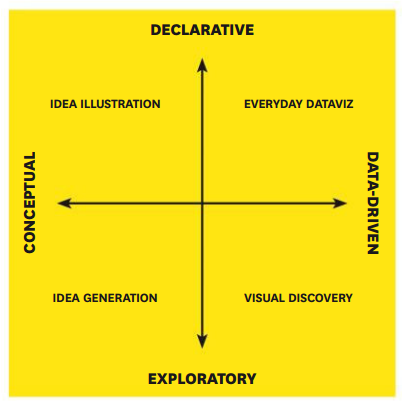
Two axes of data visualization – what works best depends on the purpose
The overall concepts are reminiscent of concepts by Edward Tufte and his many, excellent, books on visualization.
The HBR article is worth a read for anyone interested in business intelligence, data analytics, or data visualization (which, as Berinato says, is probably a misnomer – it’s not the visualization that matters, but the question it seeks to answer).