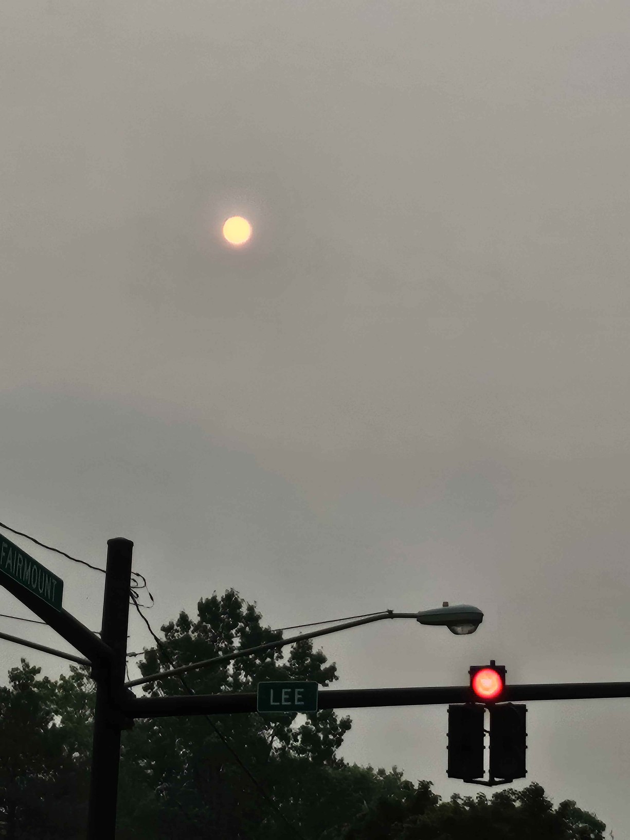
On the way to summer camp yesterday morning, my kids pointed to the sky and said “look the moon is orange!”
The strange thing about bad air is that it is usually abstract until it is not. It turns out, that was the sun at 8 am on a ‘sunny day.‘ There was so much ash in the air that you could directly stare at the sun with the naked eye, even mistaking it as the moon.
On Thursday morning, Cleveland’s sky made air quality very concrete. The sun looked filtered, the horizon was soft, and everything had that slightly apocalyptic orange-gray cast that we have now learned to associate with Canadian wildfire smoke.
And so I wondered if we could turn this situation into a little project of our own.
This was not just a pretty weird sky. Ohio EPA issued a statewide air quality advisory because smoke from Canadian wildfires was expected to degrade air quality across Ohio. Local reporting described Northeast Ohio reaching very unhealthy to hazardous levels, with public health officials advising people to stay indoors, limit outdoor activity, and use N95 masks when going outside. Ideastream reported closures and health concerns around the region, and Cleveland 19 summarized the statewide alert and local safety guidance, given very unhealthy to hazardous air quality readings.
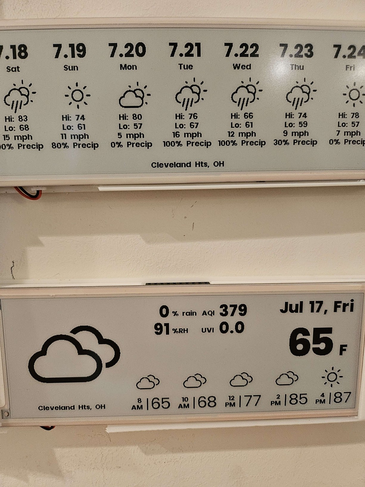
The outside numbers were jarring. At one point, city air-quality readings I was seeing were in the 700s. Even 24 hours later, it was still showing AQI 379. That is the kind of number that makes the usual vague advice to “stay indoors” feel less like background noise and more like a concrete operating condition.
I had an air quality monitor indoors, so naturally the question became: what is actually happening in here?
The value of a local number
The public AQI is the right thing to follow for community-level risk. It comes from a system designed for monitoring, forecasting, and public health communication. But it does not quite answer the household question: are the filter, windows, HVAC settings, and room conditions doing enough where I am sitting?
That is where a small indoor sensor becomes useful. Not definitive. Not calibration-grade. Not a replacement for AirNow or local health guidance. But useful enough to turn “it looks bad outside” into a trend I can watch inside.
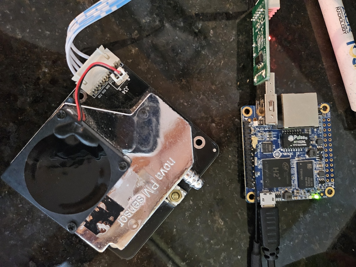
The hardware setup was not elegant. I used a handheld PC, a GPD Win Max 2, connected to a Nova PM sensor SDS011 through a small USB serial board. A little clunky? Sure. But it was the fastest way to get something working, and it worked perfectly fine. More importantly, it let me understand particle exposure inside my own house instead of guessing from the color of the sky.
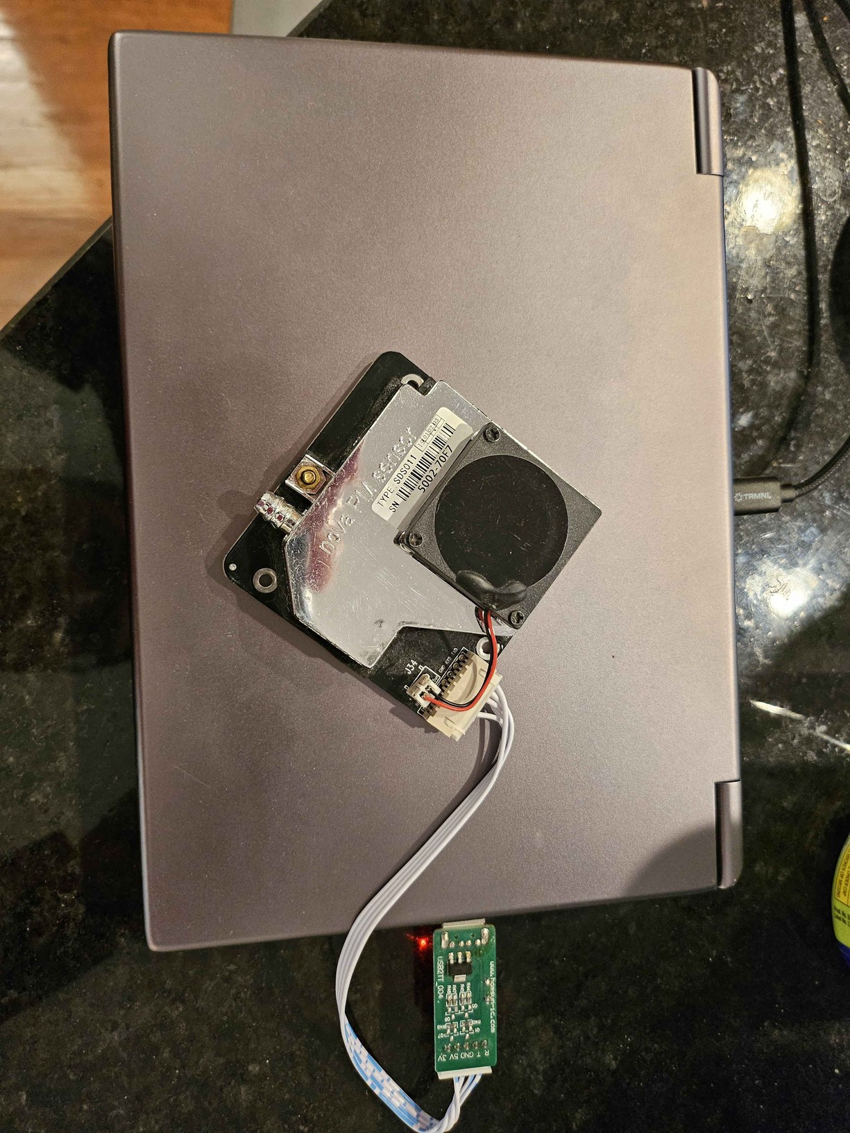
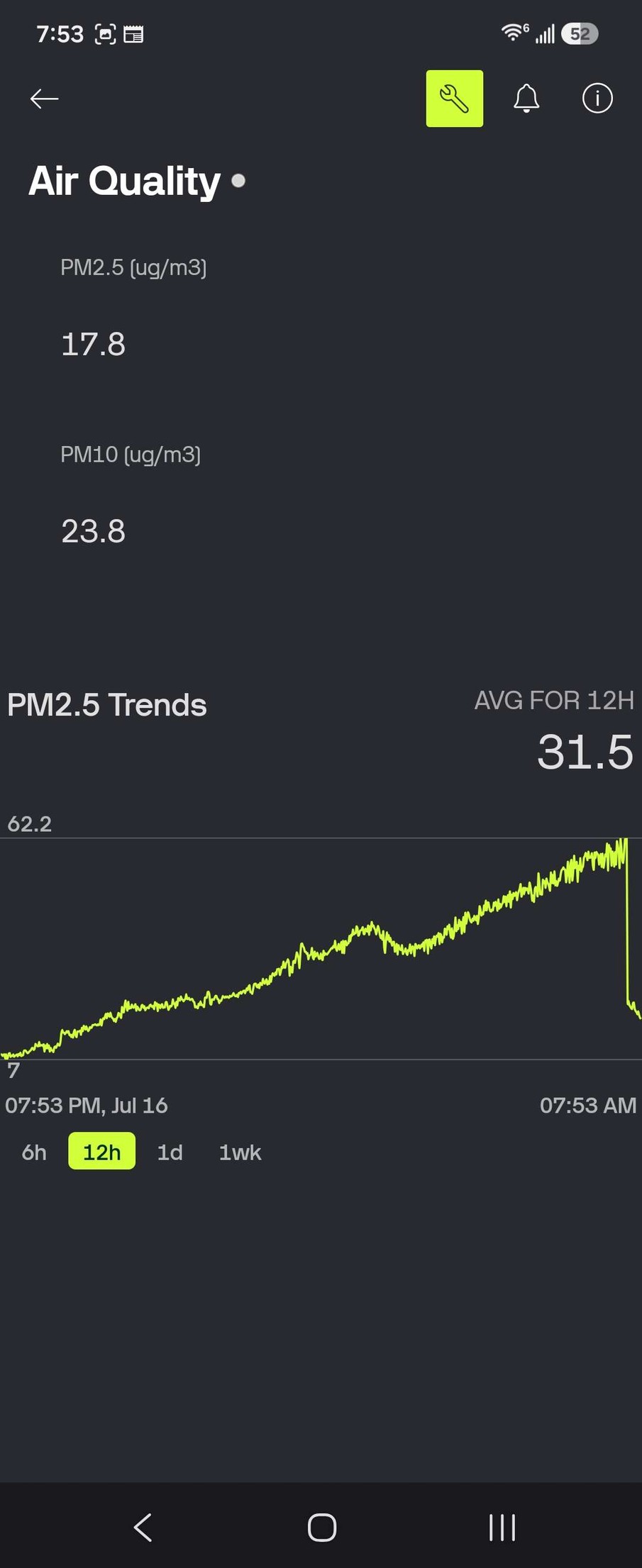
Through OpenAI Codex I built a Python script to pull the results a small dashboard on a Blynk dashboard to show PM2.5, PM10, and a short trend line. The code is available on Github.
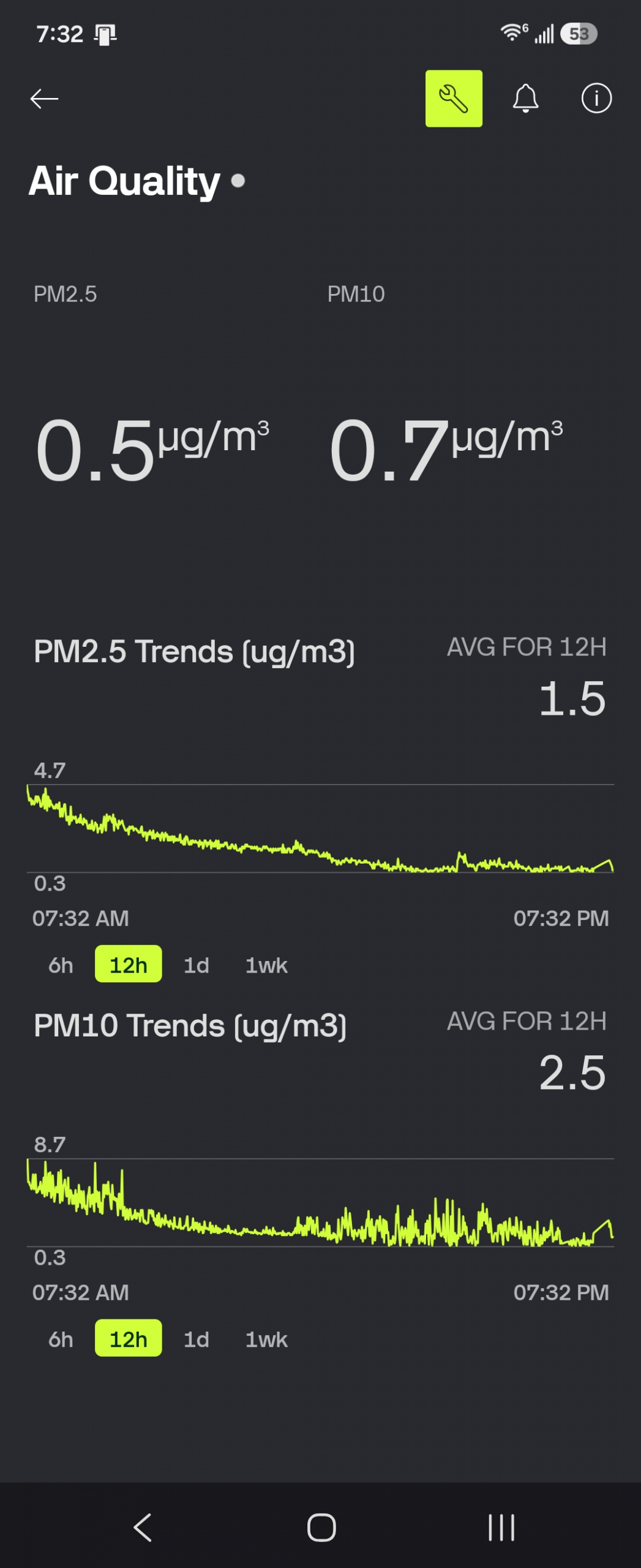
In the screenshot, the indoor PM2.5 reading was 17.8 ug/m3, PM10 was 23.8 ug/m3, and the 12-hour PM2.5 average was 31.5 ug/m3. The interesting part was not the exact decimal point. It was how steadily the curve climbed over 12 hours.
The drop at the end of the graph was not a sudden victory over the smoke. It happened when I moved the sensor from the first floor to the second floor of the house – where we have a Blueair filter running. That is its own useful observation: even within one house, different location and having an air filter running makes a difference.
If indoor PM2.5 is drifting upward over 12 hours, that is a different situation than a brief spike from cooking, opening a door, or moving the sensor.
It changes the practical question from “what is the AQI outside?” to “is my indoor mitigation holding?” (Answer: kinda sorta?)
A small informatics lesson
This is basically the same lesson that shows up in clinical informatics: data becomes useful when it is local, timely, interpretable, and connected to a decision. A number by itself is trivia. A trend tied to an action is a tool.
For air quality, the actions are simple: close windows, run filtration, reduce indoor particle sources, avoid unnecessary outdoor exertion, and use a well-fitting mask (preferably an N95) if going outside during heavy smoke. The dashboard did not make any of those recommendations new. It just made the feedback loop shorter.
There is also a nice humility check here. Consumer sensors and quick dashboards can give a sense of control, but they should not create false precision. They are best used as adjuncts: a way to understand a local environment while still respecting the broader public health data and advisories.
Still, on a day when the sun looked like it had been dimmed by a bad Instagram filter, having a local indoor trend was reassuring in the most practical way. It gave me something measurable, something I could improve, and something that made the invisible a little less invisible.
Edit 2026-07-18: After 48 hours, things are returning to normal. I migrated the sensor to run off an Orange Pi Zero, and then updated the mobile dashboard layout to capture more data. You can see the PM2.5 and PM10 are now well below yesterday’s levels, even indoors. The endgame for this project would be eventually to migrate it to an ESP32-based chipset, eliminate the USB-to-UART converter, power it off a LiPo battery, and 3D print an enclosure for the setup. Optimization brings diminishing returns after that point. Another project for another blog post.